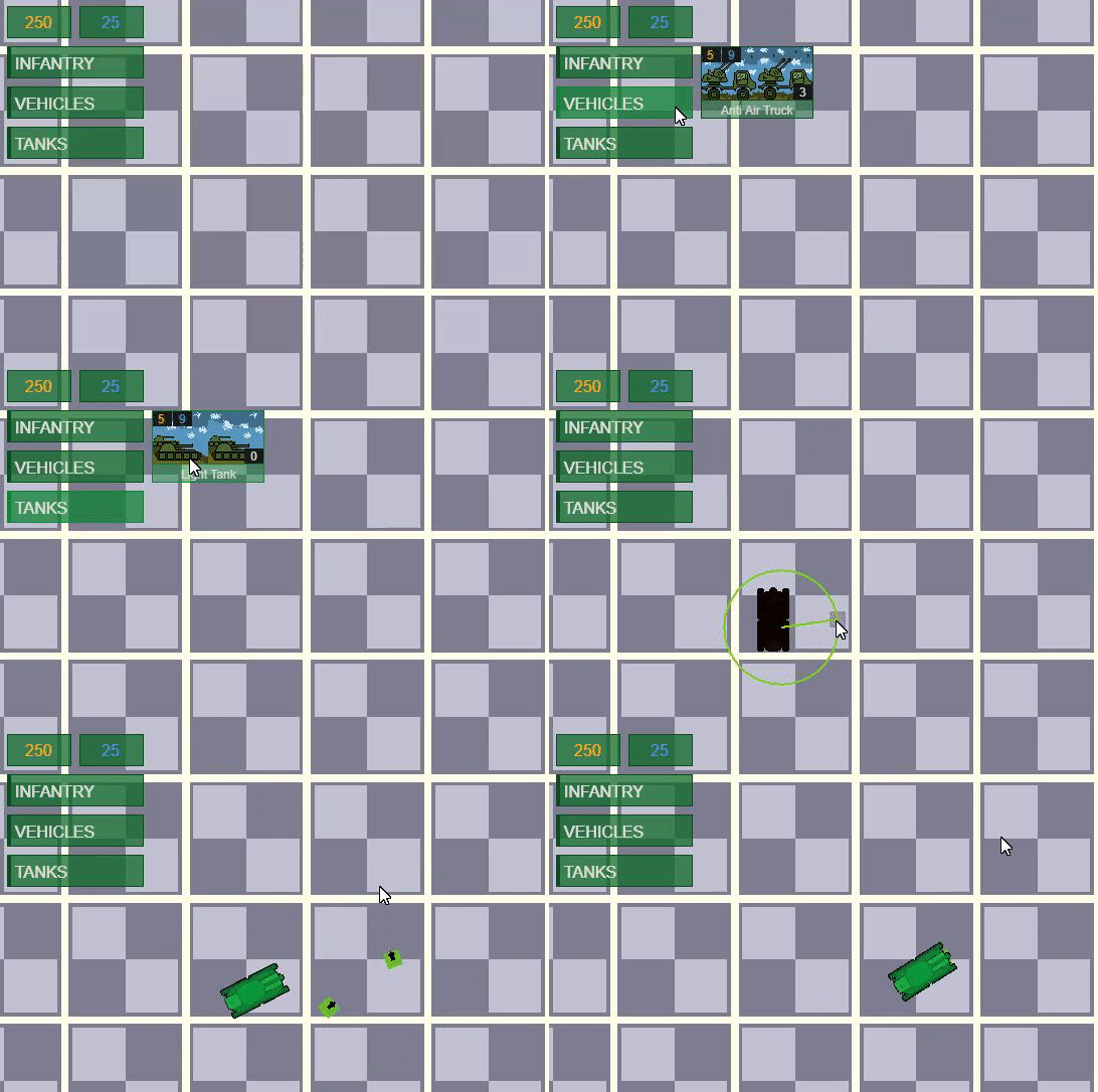
26/09/20: UI Re-Design & Changes to Re-Deployment.
Greetings from the Devlog, I have been working on changes to the deployment UI and how units are re-deployed within the battlefield.
Deployment UI: There's a lot of ways I can have this displayed on the screen; how it currently is, more RTS like down the bottom, hidden unless called requested (via a button), etc. but I have decided to go with a unit card system at the top of the screen that is heavily inspired by tiles like Wargame and Steel Division 2.
I feel this is a good mix of showing you the required information when needed, but not making the UI feel too bloated.
Re-Deployment: I have been working on changing how re-deployment works as I feel in the current version it's a little too static. I am not looking for this to become a full blown RTS, but a bit more freedom in how units can move I think brings a bit more choices to unit positioning.

Plastic Defense: Bugicide
Deploy your plastic troops against the never-ending tide of bugs in this 2D top down strategy game!
| Status | In development |
| Author | Atomic Croc Studios |
| Genre | Strategy |
| Tags | 2D, army, bugs, plastic, Top-Down, Tower Defense, War |
More posts
- 04/10/20: October 2020 - B1 UpdateOct 04, 2020

Leave a comment
Log in with itch.io to leave a comment.